SouthCross
Well-Known Member
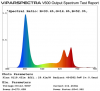
The manufacturer datasheet for a luminous brand COB. Has a chart on Wavelength. Percentage verses Wavelength.
The chart shows a single 3000k chip, driven at 100%. Has a wavelength of 450nm. Driven at 70% it's ~575nm.
What am I looking at here? What wavelength should it be?
The chart shows a single 3000k chip, driven at 100%. Has a wavelength of 450nm. Driven at 70% it's ~575nm.
What am I looking at here? What wavelength should it be?