New BP Logo...
- Thread starter weed4l!fe
- Start date
SmokesLikeBob
Well-Known Member
Nice, if you do print it on shirts, I'd buy one off ya! (Preferably black tee!)
SLB
SLB
SmokesLikeBob
Well-Known Member
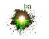
That's what I like about it, it shows how disgusting this incident is...This incident is another prime example of how we...mankind...will be responsible for our own demise...We may be the smartest living things on earth...but that's what makes our mistakes have the most impact on the world...
SLB
SLB
weed4l!fe
Member
Thx guys!!! Bob I'll let you know soon. I'm gonna have some friends critique it for me first. May make a few changes as I'm not sober at the moment and may need a clear head to find any imperfections.
And yeah this disaster is ridiculous, I live in SW Florida, luckily it hasn't reached our shores.
And yeah this disaster is ridiculous, I live in SW Florida, luckily it hasn't reached our shores.
rolledupdriver
Well-Known Member
The only thing i could say is make the brown a little darker and spot on, maybe add a dying bird covered in oil while your at it. But honestly this kind of shit disgusts me (BP I mean)
weed4l!fe
Member
Good call I noticed the brown was a little light. I will do that. Good call on the dying bird, maybe a silhouette of one would be cool. Positioning will be key though. I'll check with you guys tomorrow with a revised version. Thanks and keep the comments coming, I'm a designer so I can take quite a bit of criticism, just don't be a d!ck. I need constructive criticism. =)The only thing i could say is make the brown a little darker and spot on, maybe add a dying bird covered in oil while your at it. But honestly this kind of shit disgusts me (BP I mean)
SmokesLikeBob
Well-Known Member
Yes, constructive criticism helps build character...I will give you some as soon as I see any reason to be critical...Good call I noticed the brown was a little light. I will do that. Good call on the dying bird, maybe a silhouette of one would be cool. Positioning will be key though. I'll check with you guys tomorrow with a revised version. Thanks and keep the comments coming, I'm a designer so I can take quite a bit of criticism, just don't be a d!ck. I need constructive criticism. =)
SLB
weed4l!fe
Member
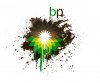
Ok some small changes, brown is now darker, put an oil slick bird into logo, it is somewhat hidden on the right side of the logo, also did a darker gradient on the upper part of the logo.The only thing i could say is make the brown a little darker and spot on, maybe add a dying bird covered in oil while your at it. But honestly this kind of shit disgusts me (BP I mean)
EDIT: Ugh I might like the original better. Not sure.
Attachments
-
 107.5 KB Views: 79
SmokesLikeBob
Well-Known Member
love the changes man, the bird was a very nice touch!
SLB
SLB
SmokesLikeBob
Well-Known Member
No problem, thanks for the rep, I'll send some your way as well...this thread has inspired the artist in me...I'm a hobbyist singer/songwriter/amateur poet...so I'll probably start a thread when I get my mind on paper! Thanks Again! and GL!
SLB
SLB
weed4l!fe
Member
Go for it bud, smoking always brings out my inner artisan...No problem, thanks for the rep, I'll send some your way as well...this thread has inspired the artist in me...I'm a hobbyist singer/songwriter/amateur poet...so I'll probably start a thread when I get my mind on paper! Thanks Again! and GL!
SLB
baaamalaaam
Well-Known Member
It should be uglier, unfortunately.
Pretty awesome, though.
EDIT:
Oh, damn!
That's badass now!
I just saw the bird!
I wonder what an oily bird skeleton would be like on there...
Pretty awesome, though.
EDIT:
Oh, damn!
That's badass now!
I just saw the bird!
I wonder what an oily bird skeleton would be like on there...
rolledupdriver
Well-Known Member
happy to cc, looks quite badass nowGood call I noticed the brown was a little light. I will do that. Good call on the dying bird, maybe a silhouette of one would be cool. Positioning will be key though. I'll check with you guys tomorrow with a revised version. Thanks and keep the comments coming, I'm a designer so I can take quite a bit of criticism, just don't be a d!ck. I need constructive criticism. =)
LickmyZach
Member
BP, what does it mean?
weed4l!fe
Member
British PetroleumBP, what does it mean?
Luger187
Well-Known Member
its the company that just spilled shit-tons of oil in the Gulf of MexicoBP, what does it mean?