"If you do not believe in climate change, you should not be allowed to hold public office"

SneekyNinja

Well-Known Member
Whats the inverse called then? 309/500 is 0.618 and 500/309 is 1.618 helps me think about it.
I haven't looked at this stuff in years but as far as I can remember it's better to think of it as a ratio of 1.618 : 1

I could be remembering wrong, my graphic design game was poor so I veered away from all that stuff in college.
 

twostrokenut

Well-Known Member
I haven't looked at this stuff in years but as far as I can remember it's better to think of it as a ratio of 1.618 : 1

I could be remembering wrong, my graphic design game was poor so I veered away from all that stuff in college.
On a line segment where there's a left and right and the larger side is about 62% of the whole then the smaller side is about 62% of the larger side at this ratio. Spiral out or in, either way seems almost the same if you think about one as just whole.
 
Last edited:

SneekyNinja

Well-Known Member
On a line segment where there's a left and right and the larger side is about 62% of the whole then the smaller side is about 62% of the larger side at this ratio. Spiral out or in, either way seems almost the same if you think about one as just whole.
It's been probably 10 or 11 years since I learned about it so I'll just logically defer to your point because I can't argue it from any decent certainty.
 

ttystikk

Well-Known Member
I'd like to see stalin hitler a pope and ghandi on there for reference. That one seems hard core no room for mao or hitler or che on that one .. like it's a close up. Or an observation of u.s. polititian... Idk cool.
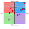
All of those leaders fit in that scale. I posted this one specifically to show just how skewed the American political 'spectrum' really is.

Politicalcompass.org

They even have a quiz you can take to see where you land. I'm buried down in the bottom left corner lol
 

esh dov ets

Well-Known Member
All of those leaders fit in that scale. I posted this one specifically to show just how skewed the American political 'spectrum' really is.

Politicalcompass.org

They even have a quiz you can take to see where you land. I'm buried down in the bottom left corner lol
http://www.isidewith.com

i even posted a thread for people to dox me ;)

https://www.rollitup.org/t/isidewith-political-quiz.936151/

tty i feel like the chart with bernie and all the right wingers is a zoomed in view. they are all a little different
 

fdd2blk

Well-Known Member
LMAO you only wish you had my social calendar!

But you wouldn't know what to do with hot classy women in the intellectual 90th percentile who write dispensary business plans.

I see the mods are still deleting my replies to you. It must suck to be so fragile.
 

twostrokenut

Well-Known Member
It's been probably 10 or 11 years since I learned about it so I'll just logically defer to your point because I can't argue it from any decent certainty.
Idk if I had a point other than 162% is about the same as 62% minus the whole and that this majority is what we call good.
 

twostrokenut

Well-Known Member
All of those leaders fit in that scale. I posted this one specifically to show just how skewed the American political 'spectrum' really is.

Politicalcompass.org

They even have a quiz you can take to see where you land. I'm buried down in the bottom left corner lol
So Ron Paul is a right wing authoritarian, you are a libertarian and the nazis were freedom oriented fiscal conservatives.

Bravissimo.
 

Fogdog

Well-Known Member
We've gone round and round with this before. Did you go to the website and read their explanation?
We've talked about it. But our conversation ended rather than concluded. I did go to the website and read their "explanation". It just discussed the method but not validity. Graphs like this are pretty much meaningless but look meaningful because we are used to seeing real information mapped out using real data points and real units of measure. Not saying it's fake, just not as meaningful as you seem to think it is.

I don't understand the units. Is it oranges up and down and apples left and right? The scale is subjective and not linear, meaning the distance between the hash marks don't represent a uniform increase in whatever the units are. The graph coveys a false sense of uniform differences. It is more of a distortion of reality than an representation of it.
 

ttystikk

Well-Known Member
We've talked about it. But our conversation ended rather than concluded. I did go to the website and read their "explanation". It just discussed the method but not validity. Graphs like this are pretty much meaningless but look meaningful because we are used to seeing real information mapped out using real data points and real units of measure. Not saying it's fake, just not as meaningful as you seem to think it is.

I don't understand the units. Is it oranges up and down and apples left and right? The scale is subjective and not linear, meaning the distance between the hash marks don't represent a uniform increase in whatever the units are. The graph coveys a false sense of uniform differences. It is more of a distortion of reality than an representation of it.
Then discuss the distortions.

Mrs Clinton struck me as less authoritarian than the crowd of Republican candidates, but no less conservative. Thus her place on the graph rings true to me- as do theirs.

Mr Sanders did not suggest nationalizing major corporations in America or forcibly relieving the upper class of their wealth. Therefore, calling him a socialist isn't accurate. He's a centrist and only by the skewed perspective of our Overton window does he look 'leftist'.

Did you take the quiz and see where they plot your position on the graph? I think the quiz itself is instructive.
 

Fogdog

Well-Known Member
Then discuss the distortions.

Mrs Clinton struck need as less authoritarian than the crowd of Republican candidates, but no less conservative. Thus her place on the graph rings true to me.

Mr Sanders did not suggest nationalizing major corporations in America or forcibly relieving the upper class of their wealth. Therefore, calling him a socialist isn't accurate.

Did you take the quiz and see where they plot your position on the graph? I think the quiz itself is instructive.
I have discussed the distortions. Adding subjective scores on different topics to gain an overall score is fake math. It's like putting a "4" to score "I like sunny days" and a "2" score for "I like clear blue sky" and adding them together. Sure the number is "6" but what does that mean? If somebody scored 12, do they like good weather twice as much as somebody who scored 6?

Agree that Sanders is not a socialist. Disagree that Clinton was conservative. I don't need a graph to communicate that. Especially if the graph was developed using fake math.
 

ttystikk

Well-Known Member
I have discussed the distortions. Adding subjective scores on different topics to gain an overall score is fake math. It's like putting a "4" to score "I like sunny days" and a "2" score for "I like clear blue sky" and adding them together. Sure the number is "6" but what does that mean? If somebody scored 12, do they like good weather twice as much as somebody who scored 6?

Agree that Sanders is not a socialist. Disagree that Clinton was conservative. I don't need a graph to communicate that. Especially if the graph was developed using fake math.
Lol I disagree with your assertion that Mrs Clinton isn't fiscally conservative and socially only marginally less so.

So now we're just chasing each other's tail.

I'll be looking for and voting for a Sanders style party wing. I'm not alone and the establishment Democrats will ignore us at their peril.
 

SneekyNinja

Well-Known Member
Idk if I had a point other than 162% is about the same as 62% minus the whole and that this majority is what we call good.
Stop getting so mad, I did the equation and that was the answer I got.

I even said "fine for the sake of argument you're right".

The equation is ((1 + sqrt(5))/2) which is 1.618033988749894848204586834.
 
Top